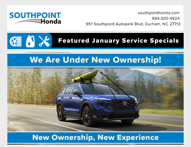
This showcases the transformation of email designs since my initial involvement, highlighting the creative direction I’ve taken to infuse modernity and visual appeal into them. I’ll delineate the improvements across three distinct sections for clarity and a more comprehensive understanding of the positive changes made.
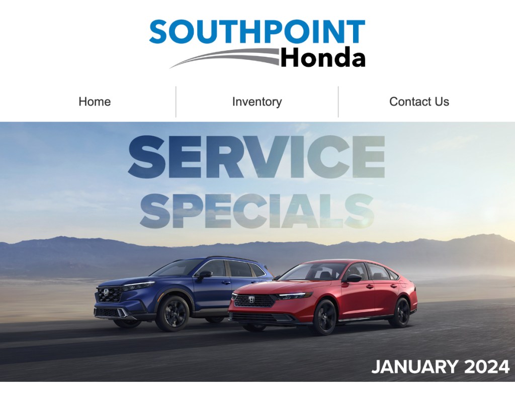
I revamped the header to enhance its visual appeal, opting for a sleek and modern design. The initial blocky appearance was replaced with a more streamlined and cohesive look. To improve user experience, I introduced a user-friendly navigation menu, ensuring seamless redirection to the selected site option. The header now commands attention with an increased size, and I skillfully integrated the text seamlessly into the background image for a more polished and sophisticated aesthetic.
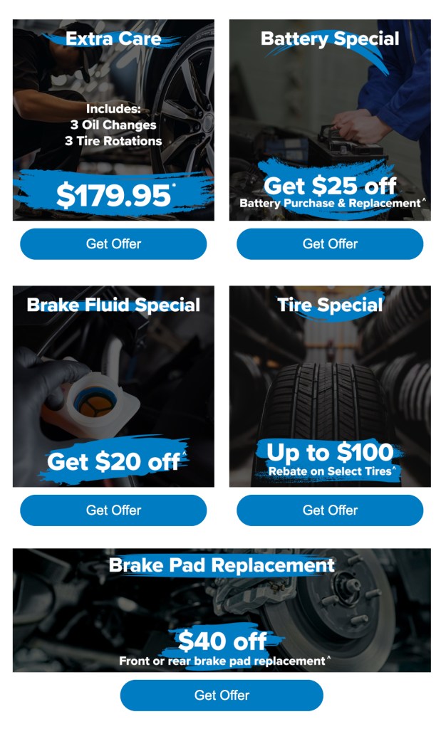
I enhanced the body by making service offers visually appealing. Each offer now features a distinct design, clearly presenting details like price and services in the middle. Additionally, I updated the overall design to a more modern look. Plus, I added a ‘Get Offer’ button below each for easy access.

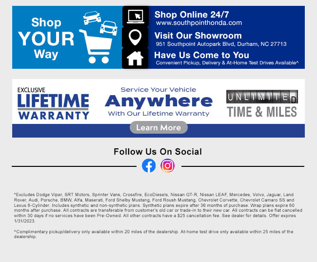
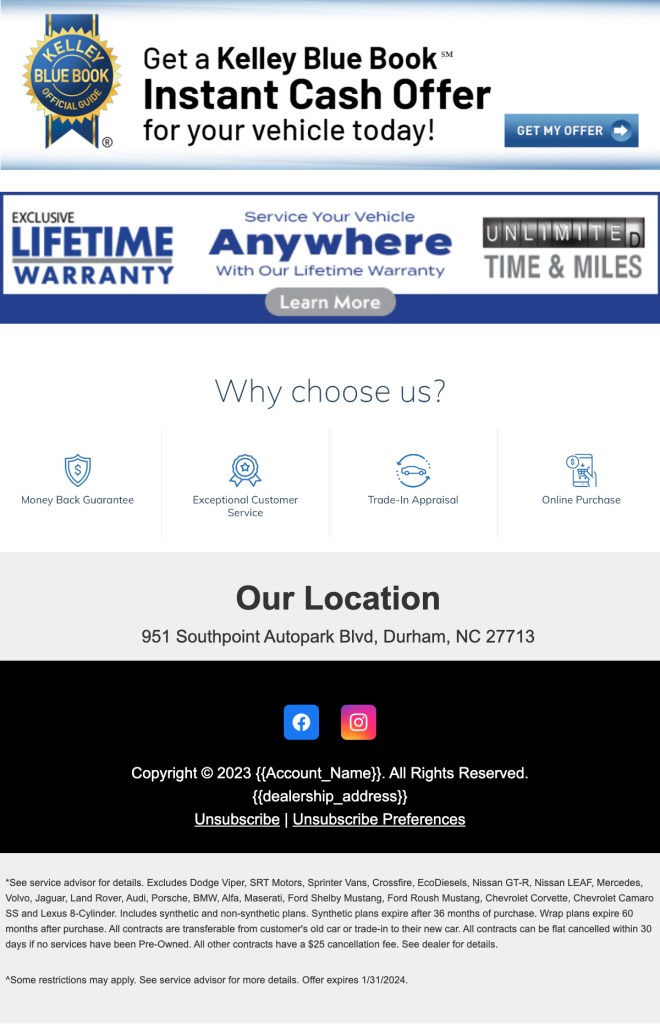
I upgraded the footer by giving it a solid background for a cleaner look and added a modern touch with improved hierarchy and distinct sections. I also included a ‘Why Choose Us’ banner showcasing dealership features. Alongside these updates, you’ll still find the usual elements like location, social links, and disclaimers.
 Hunter Tenney